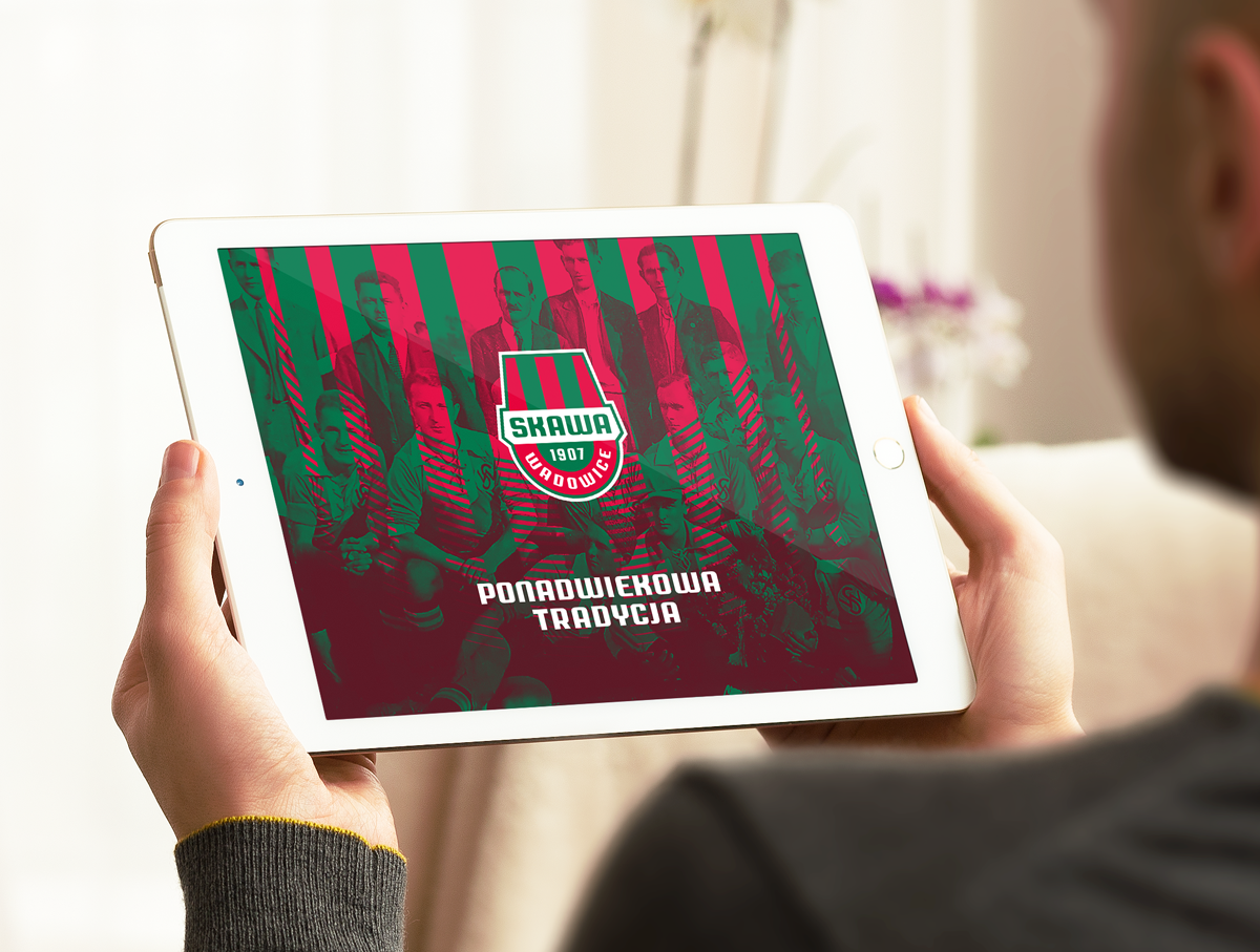
SKAWA WADOWICE
One of the oldest Polish sports clubs Skawa Wadowice asked me to refresh their logo. As I carried out this project, I did some research into the history of the club, which has many things in common with the most important Kraków clubs since the beginning of their existence. Skawa’s greatest success was playing in the Polish third division.
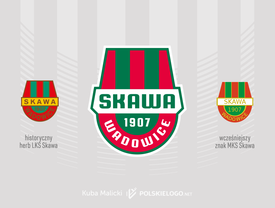
The former MKS Skawa emblem had a lot of design shortcomings, like the rickety lettering and the inconsistently drawn contours of the shield. In addition, the yellow colour of the text on the white background was quite difficult to read. I decided to change the colour when designing the new logo but I also changed the shape of the horizontal field of the shield, curving it at the sides at the same angle as the upper part of the emblem.
![]()
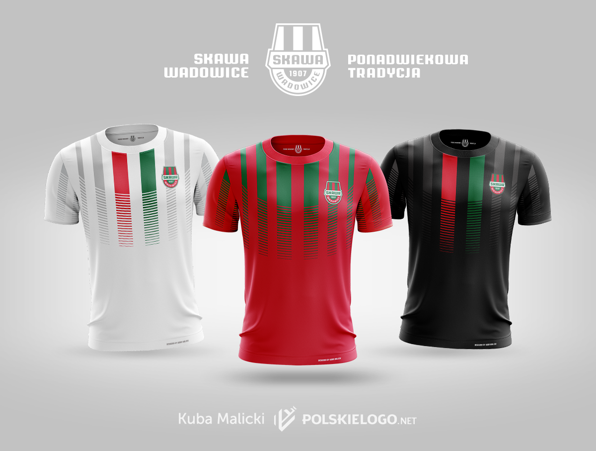
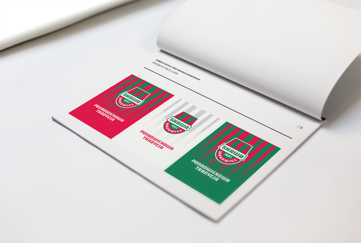
In addition to the emblem design, I created a brand-manual and basic identification elements for the club from Wadowice.