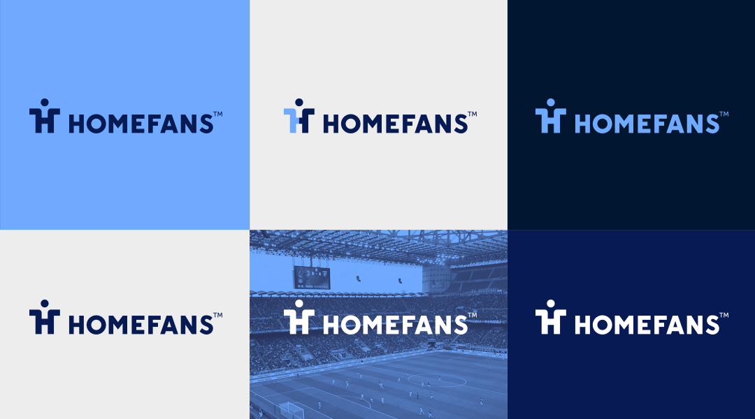
Homefans
Homefans is a platform that brings international travelers together on handpicked bucket list football experiences guided by locals. There are travel brands with a similar approach, however in football / sports there doesn’t exist a similar concept as Homefans. They have specialized in sport travels operated by locals. What makes Homefans so incredible is something more – it’s the memories our customers take with them long after they’ve returned home. And now with the new business model we want to replicate this to a broader audience with the experience as a core.
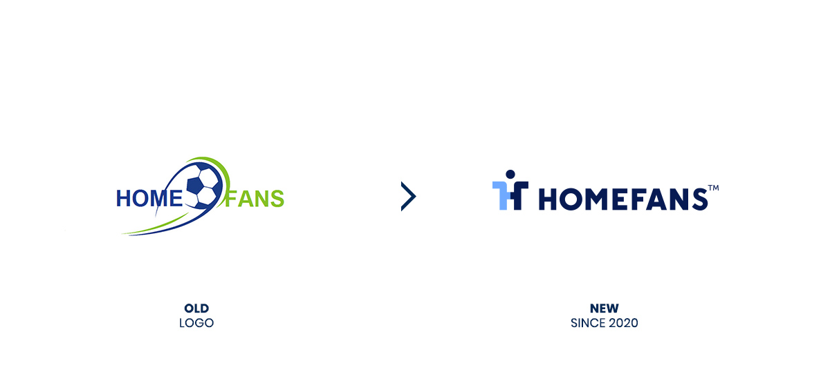
In July 2020 I was invited to work on the new logo and Corporate Identity materials for Homefans.
REBRANDING PROCESS
Every time I create a logo, I look to combine the characteristic features of the organization with the simplest possible graphic form.
The Homefans logo intends to symbolize the unique aspect of their journeys. Not only can you watch a sports spectacle without fear of getting a ticket or accommodation. You can actually feel like a fan of the local team and meet people with similar passions.
To capture this, I was looking for symbols associated with locality, experience, and – above all – people.
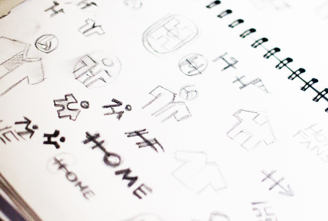
The first of these symbols is the football jersey, which symbolizes being a fan of the club you are visiting and also serves as a souvenir of your trip.
This shirt is styled as the letter ’H’ for Homefans and the shape of the letter has been divided into two. This enables Homefans to change the color composition to suit the occasion.
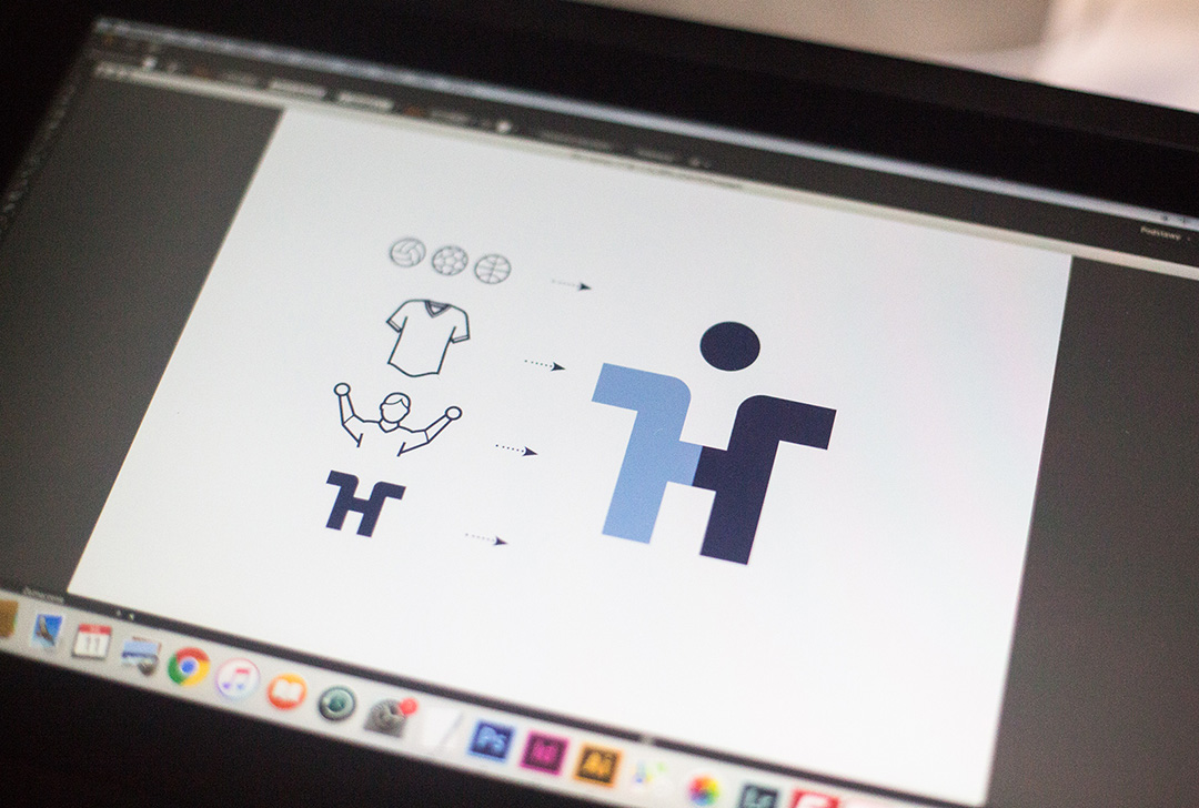
Above the jersey, I put a small circle that symbolizes an abstract ball, regardless of the sport. Because in time, Homefans will offer trips and day tours not only to football stadiums but other sports as well.
The logo also takes the form of a person’s silhouette. Because above all, the company’s offer is directed to sports fans.
