BANK OF BETS
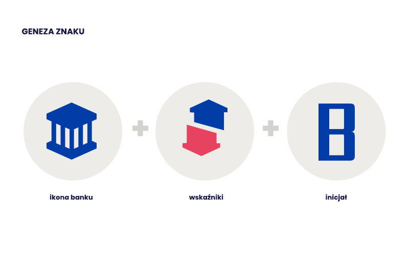
This was a logo design and CI materials for an English website which ranks bookmakers. From among several proposals, the client chose a design which connected the icon of a bank and the letter „B”.

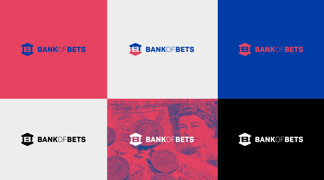
The basic version of the logo appears in a blue-crimson tone.

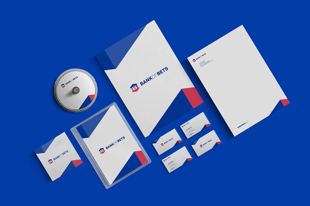
In terms of the identification materials I proposed a characteristic abstract motif, referring to the shape of the logo.
