RYMER RYBNIK
Rymer Rybnik are celebrating their 100th anniversary this year. However the club with a mining past almost went bankrupt two years ago. Only a handful of spectators watched their matches in the Polish 6th tier – most of these fans were those that remembered the club in its heyday in the 1990s when they were nearly promoted to the Polish second tier. Another symbol of the backward looking direction of the club was their old-fashioned logo.
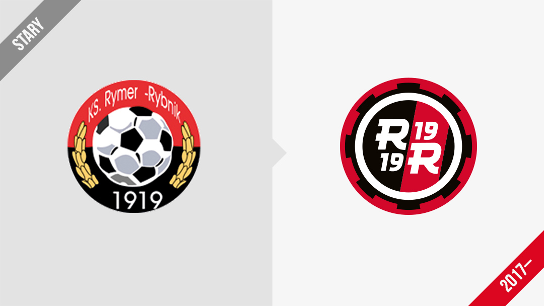
Not many supporters remember that the club played one season in the Polish top flight in 1948! In 2016, I described their story on PolskieLogo.net and released an original version of their brand as part of the „How I see it?” series. Crazily enough, my design had a massive impact and one year later the club decided to make large changes, including using my project as their club emblem!
![]()
My original design alludes to the industrial lineage of the club (the cog wheel fitted to a rim).
![]()
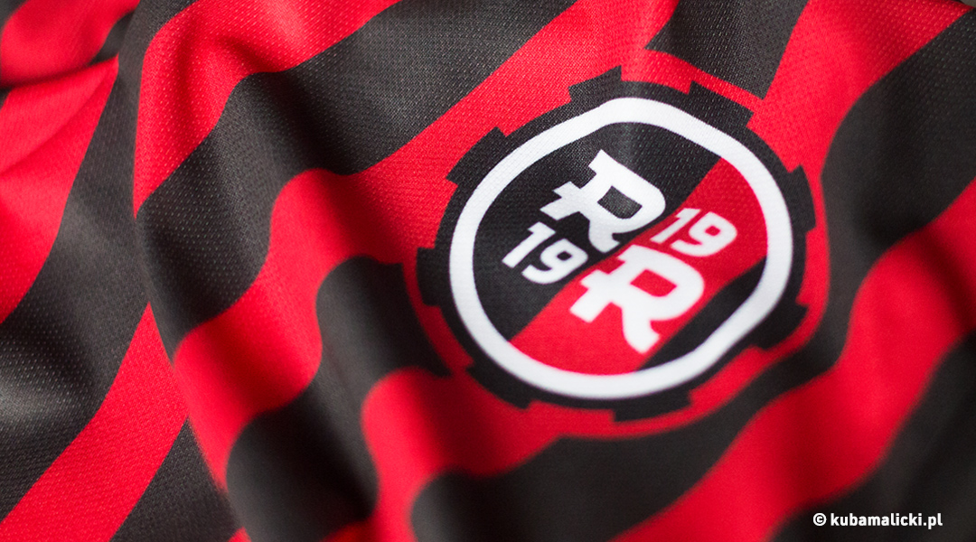
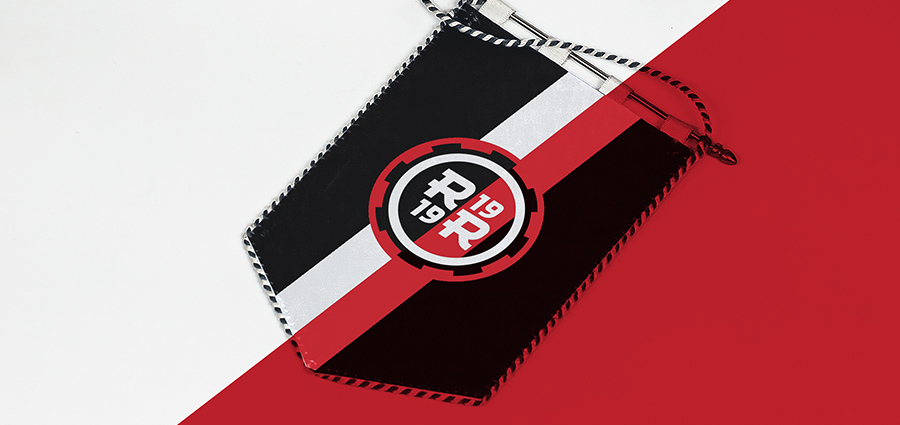
The sign contains a characteristic slanted belt, which was to be used in image materials as a graphic motif in the background.
In 2017, the sign was approved by the new club board, and it was voted the „Logo of the Year” by readers of the PolskieLogo.net website!
![]()
![]()