POGOŃ ŚWIEBODZIN
Pogoń Świebodzin interested me at the turn of the century, when the football team appeared in the Polish fourth tier, and I created the clubs’ crests for the purposes of the website 90minut.pl. Since the fall of Communism in Poland, the Western Polish club did not have its own consistent logo and, as a result, in 2003 a competition was organised to provide them with one. As a young man learning vector graphics programs, I decided to enter the competition. I sent a few e-mails to Pogoń’s site administrator , but it turned out that club officials did not like any of my designs. The competition was won by a logo of a shaking „ladybird” ball with the club’s name „stuck” to the black border of the shield.
14 YEARS LATER
After a long period of playing in the fourth and fifth tiers, the club experienced financial hardship and went bankrupt. In the meantime, another club in Świebodzin was making their way through the football pyramid. The club, called „Santos”, decided to take on the name “Pogoń” in 2017 and I was given the task of preparing a new club logo.
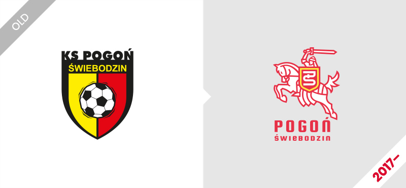
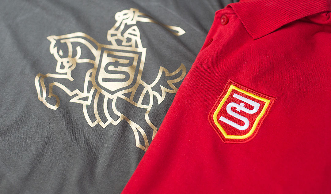
I suggested that the logo of the Świebodzin team should be a knight on a horse, referring to the old „Pogoń Lwów” coat of arms, as most of the inhabitants of the town have ancestors hailing from Poland’s Eastern territories which it lost at the end of the Second World War.
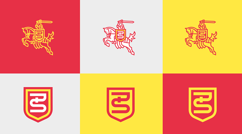
At first glance, the project was revolutionary, both in the context of the earlier club sign and the specifics of Polish sports emblems. In the centre of the logo, I put a monogram – made up of the club’s initials „P” and „Ś”, which some people found difficult to read. Initially the clubs’ fans were angry, calling for the restoration of the 2003 logo.
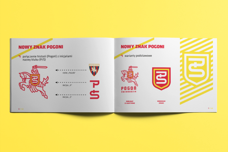
Thankfully the CEO did not change his mind and the project is still used by the club to this day. In 2017, the emblem ranked first among expert opinions in the „Logo of the Year” competition on the PolskieLogo.net website.
