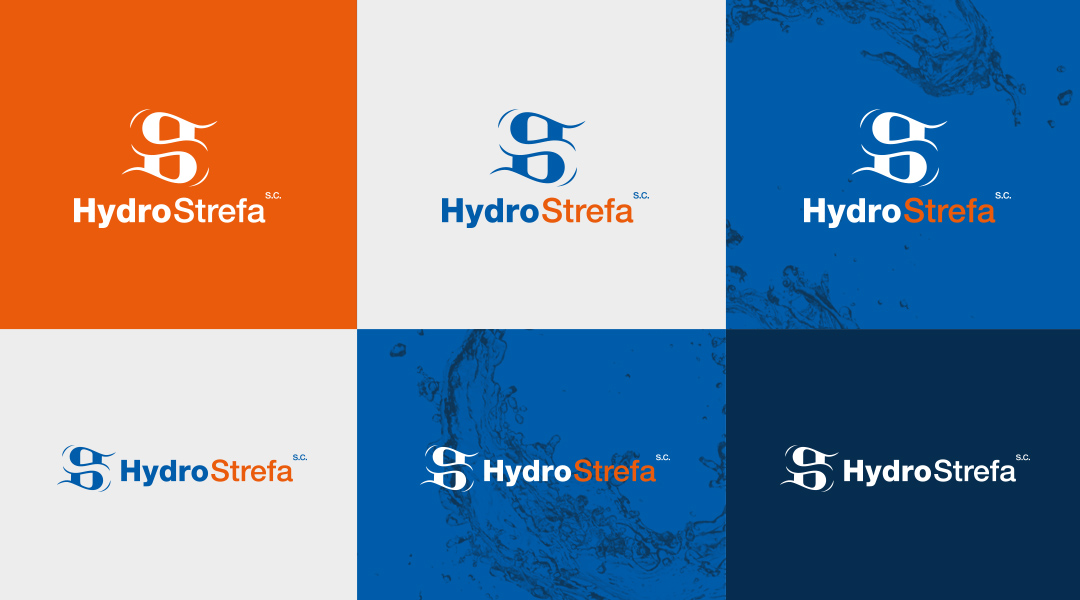
HYDRO-STREFA
One of the first projects that I did during my studies – a graphic sign and CI elements for a store selling hydraulic materials and heating technology.
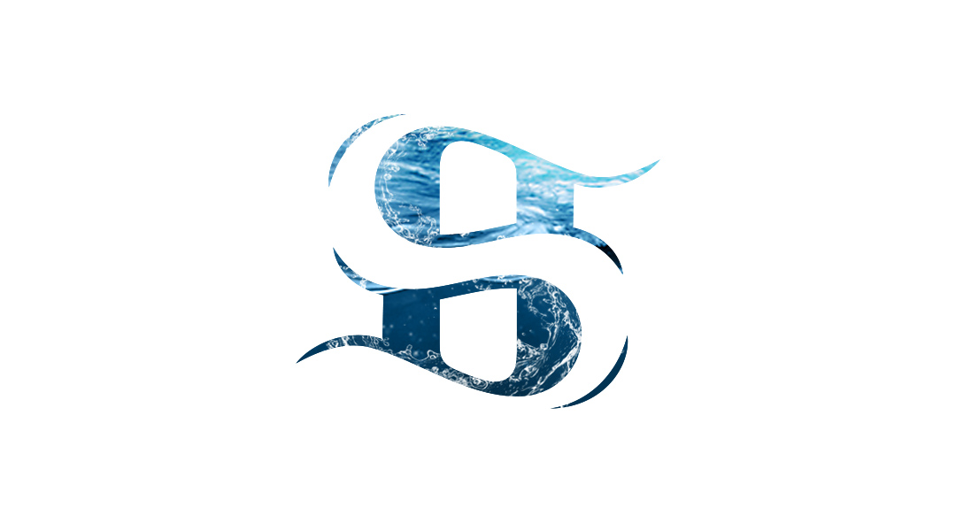
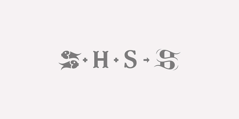
I created a symbol based on the letter „H” (from „Hydro”) and a cut-up letter „S” (from the Polish word for „Zone”). At first glance, it resembles two fish which symbolize pure water.
The logo is available in a colourised version against a plain background, a semi-inverted version against a blue background and a plain version against other coloured backgrounds.
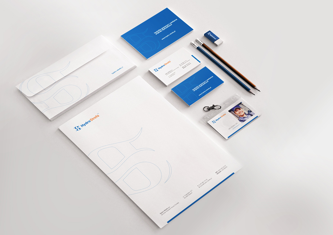
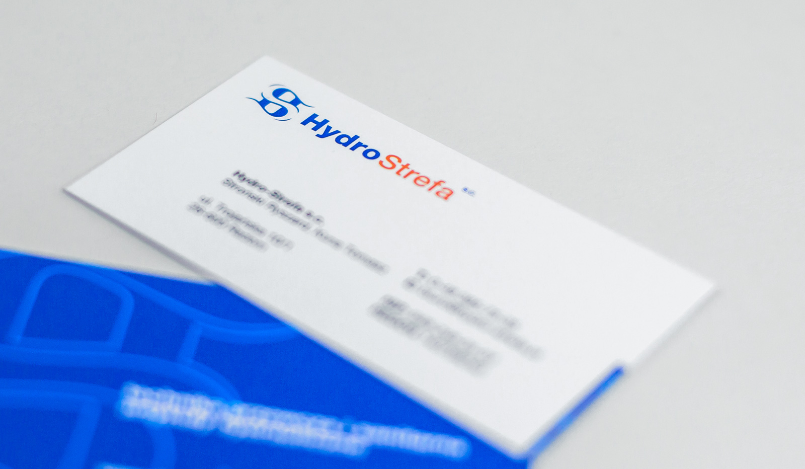
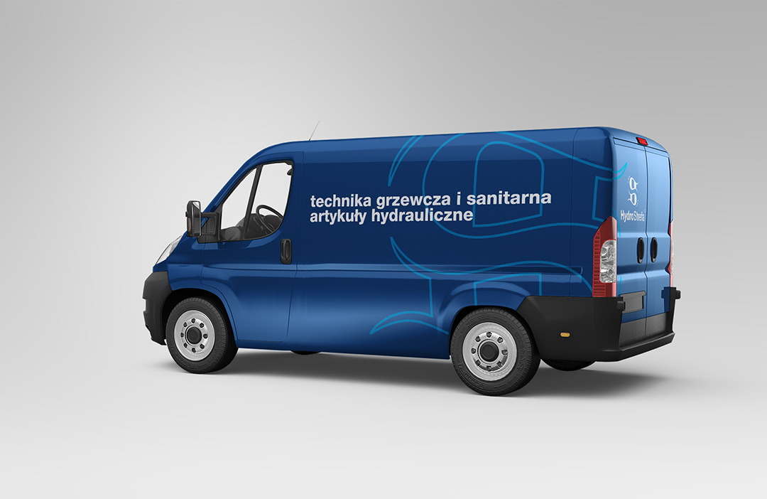
In addition to the logo, I also developed a set of basic identification materials for the company.
YEAR
2005
CLIENT
Hydro-Strefa S.C.