OSIR KROSNO ODRZAŃSKIE
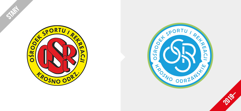
I designed a new logo for the Ośrodek Sportu i Rekreacji [in English: 'Sports and Recreation Centre’] in Krosno Odrzańskie. The previous OSiR logo was developed in the 1990s and had become dated over the last two decades. From the three rebranding visions, the client chose to refresh the old logo.

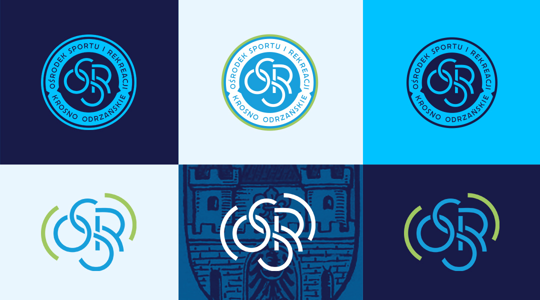
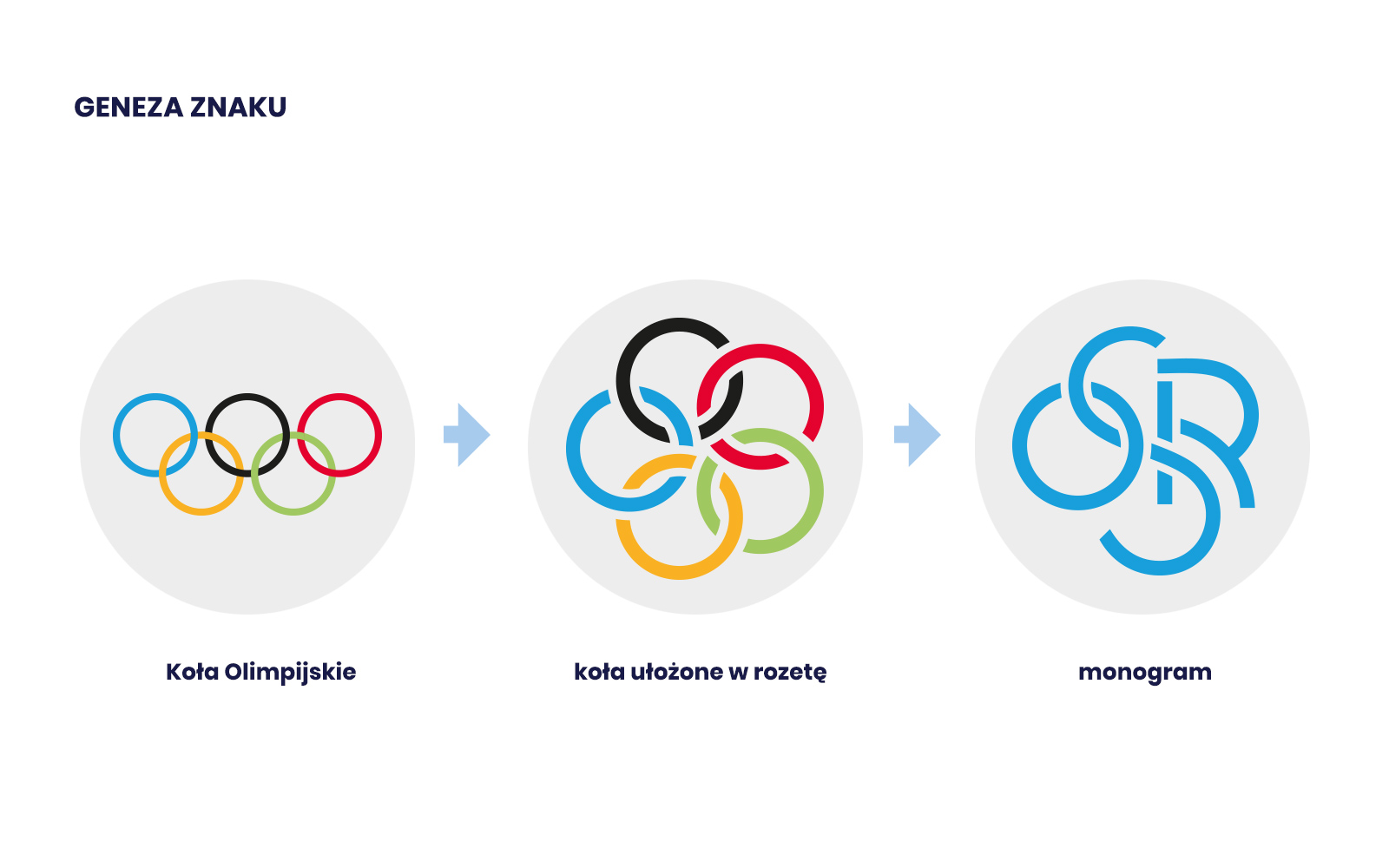
The new logo is available in two versions – a simplified monogram in which the letters resemble the Olympic circles arranged as a rosette and an extended version (an emblem). The colours refer to the colours of the Krosno Odrzańskie city flag.

The process of creating the logo is illustrated in the animation below.
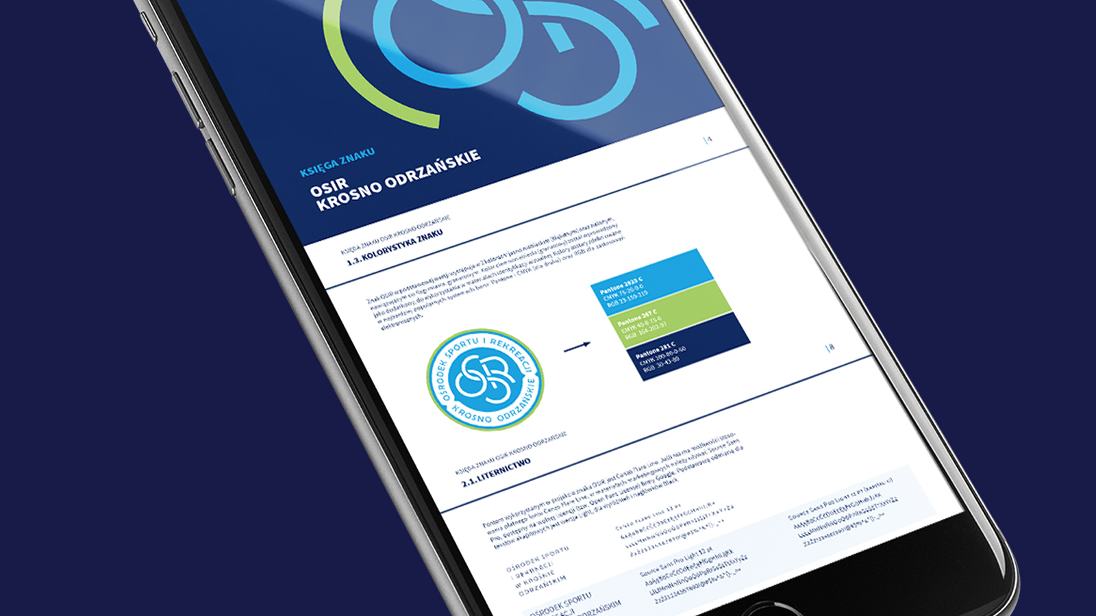
The brand-manual contains a description of the logo variants, their rules of use and how they should be applied in various mediums.

