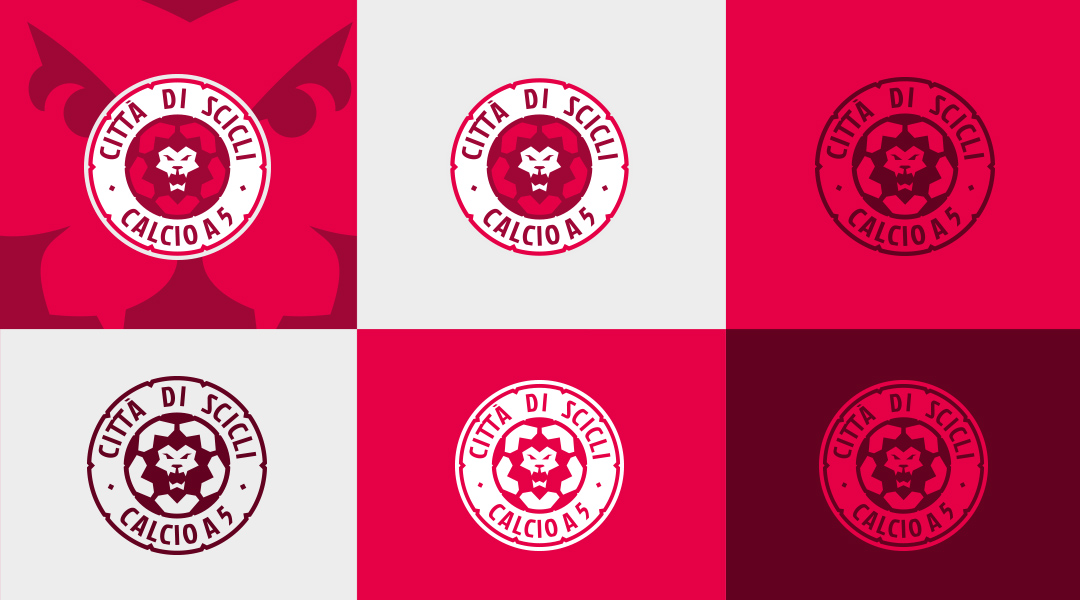
Città di Scicli
Beautiful island, idyllic landscapes, majestic architecture and sculptures… Sicily can be loved. But why the logos of the local sport clubs are not so cool? I tried to change the marks of some Sicilian teams in the cooperation with my Italian business partner, Penta Sport Management.
The futsal club named Città di Scicli ASD was one of the most interesting case, especially because the symbol of Scicli commune – a lion staying on the 3 hills – and the big range of the branding to do. They had a plans to grow their brand and get promotion to higher leagues.
I started working of Città di Scicli logo in 2013. Firstly I created some variations refers to the Scicli’s Coat of Arms. They chose the badge similar to the football emblems – closed in the purple shield. There was more classical crest than modern logo but they were satisfied of the project.
3 years later the club was going to get a huge sponsor from the developer’s industry – Remax company. We helped the Scicli club to build the proffessional offer and suggested to convert the crest to more modern logo. Then I created the logo with the lion head put on the ball and original shield with 2 shades of red. Unfortunately we weren’t able to convince Scicli management to the new logo, they were more conservative than we expected.
I wish they come back to the project in the future, there’s one of my favourite sport logos I’ve ever done.
YEAR
2013, 2017
CLIENT
Penta Sport Management