SILESIA
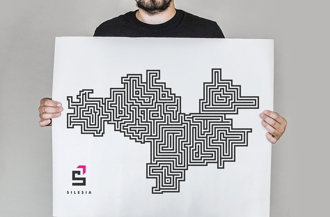
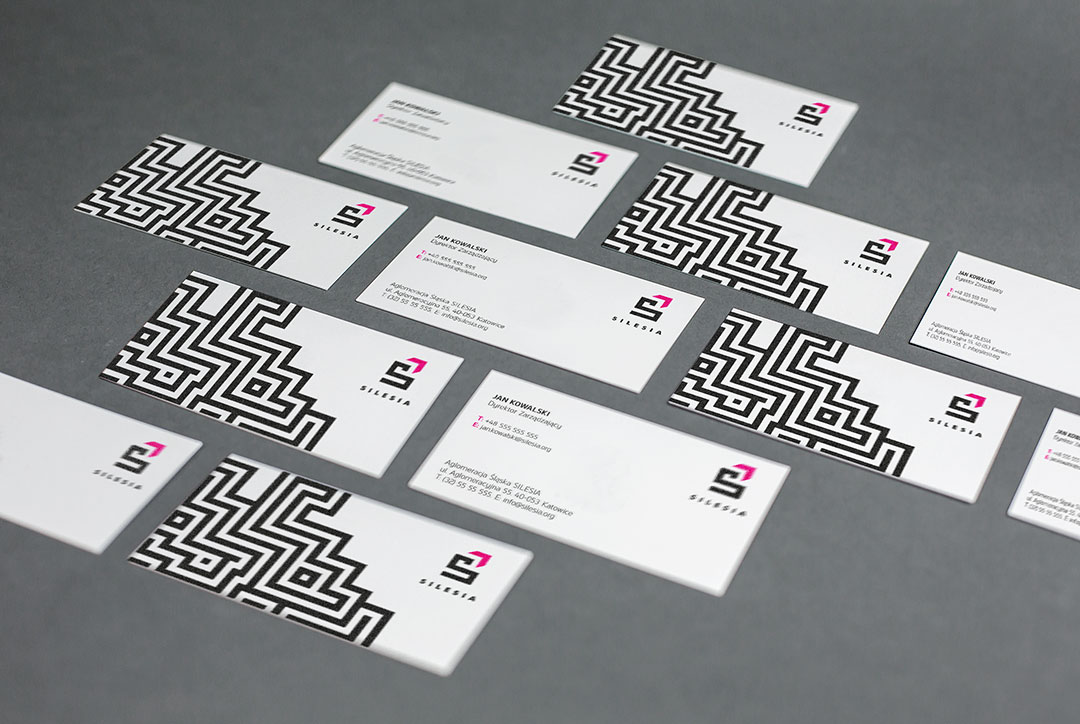
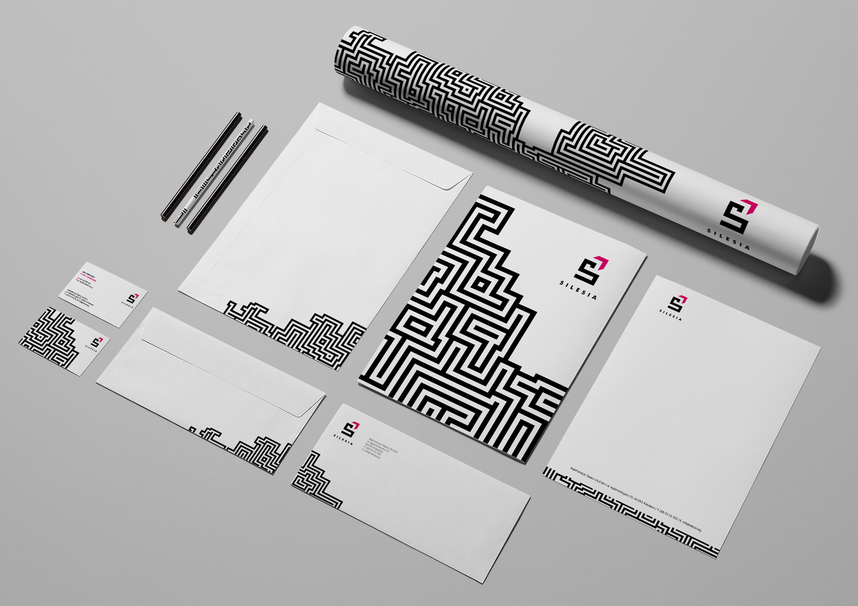
In 2007, officials of the 14 cities which make up the Upper Silesia Conurbation decided to create a federation initially called the Silesian Agglomeration (its current name is the Silesian Metropolis). A logo contest was announced in which I took part. I designed a logo based on the letter „S” with an arrow symbolizing development. A black colour was used to symbolize the mining past of the area, and magenta was used to symbolize the optimism and transformation of the Metropolis into a services hub.
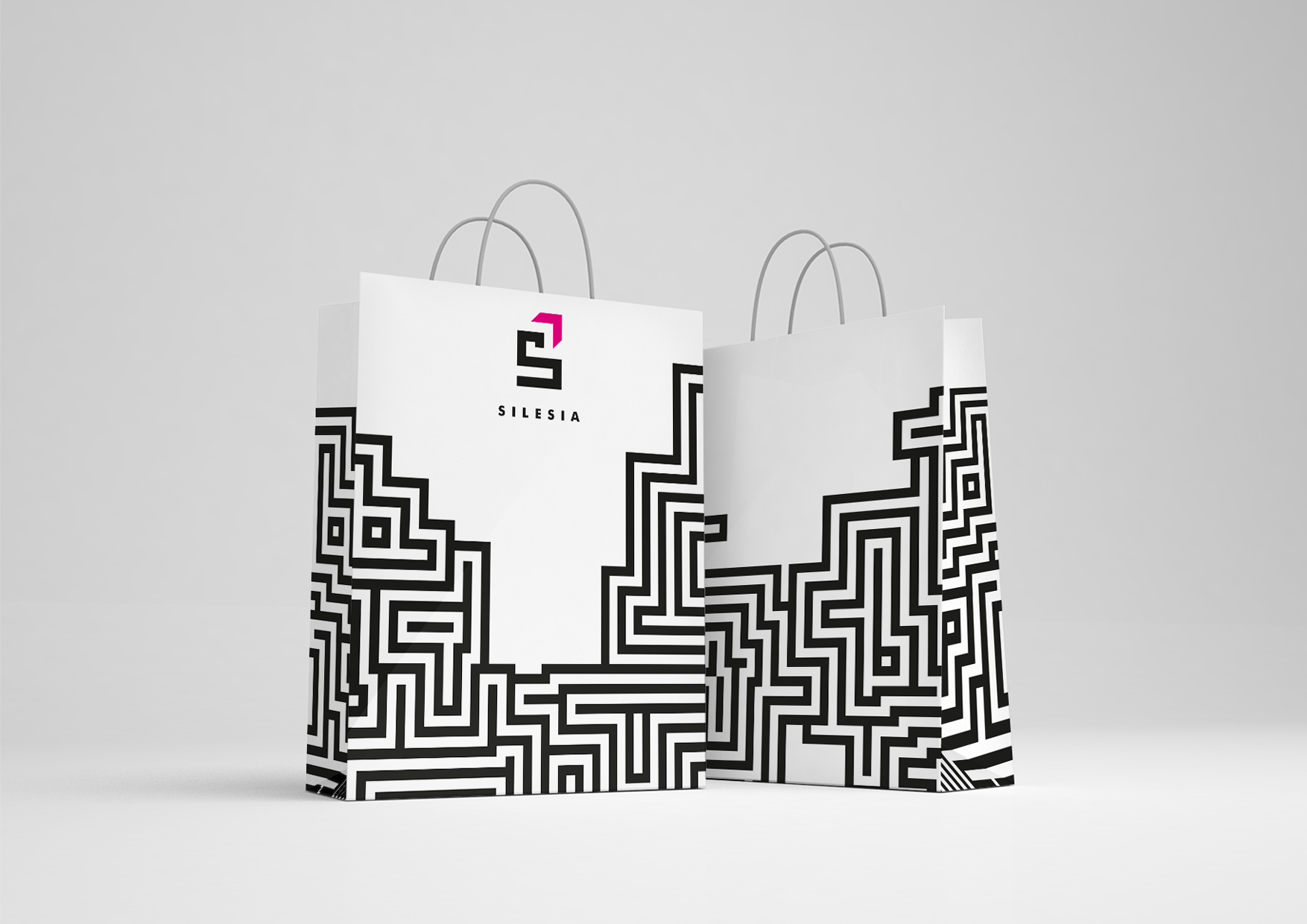
As it turned out, the jury did not choose my project – the winning design depicted the urban area forming the Upper Silesian Metropolis constructed of tiles.
![]()
In 2018 the Metropolis was rebranded once more, and the new project consists of the letter „M” with an arrow pointing down …
As a matter of interest – in 2014, the Silesian Museum released a logo with a very similar letter „S”. It’s clear that my project was highly regarded as two Katowice institutions have decided to implement something similar to it.
YEAR
2007
CLIENT
Logo Contest