Odra Opole
When the titled and long-lived football club is going to refresh their identity, a designer should initiate an interview about history and supporters relation before start working. Odra Opole has been writing their story in Polish top division during 22 years, from 1953 to 1981. In 1964 they finished top league on the 3rd place and that was the best achieve in their history.
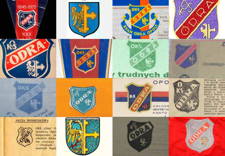
In 90s they’ve been loosing the meaning in Polish football, and finally was relegated to 3rd level. The way back to the higher level was so long and difficult, with the cruel finish in 2009. Then Odra reached the 2nd level but after the season they became a bankrupt.
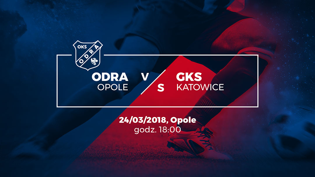
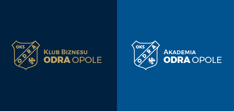
Opole had to wait next 9 years to back on the 2nd level of Polish football competitions. In the summer 2017 Odra made dreams come true and the management also decided to make a progress in the visual identity. I got the task to refresh Odra’s crest and prepare brand manual and CI materials.
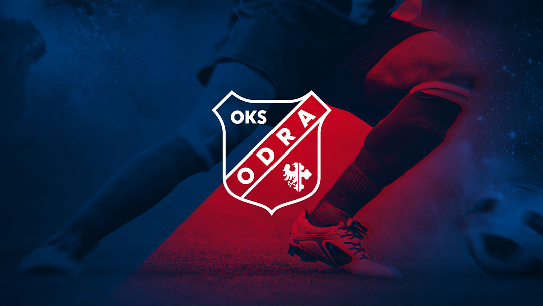
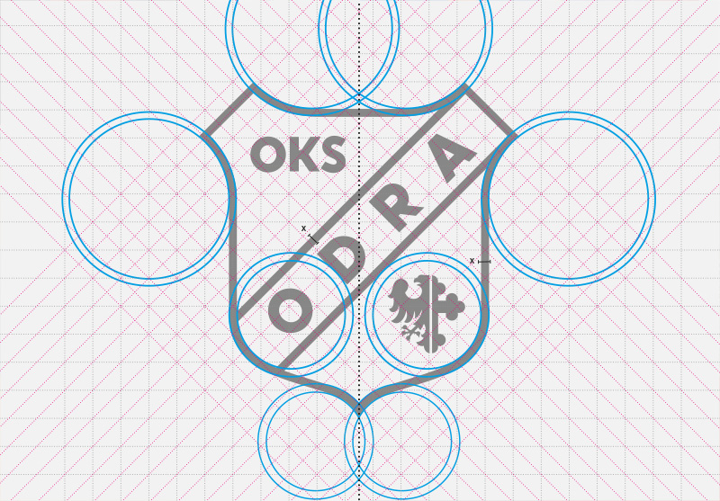
The emblem of Odra weren’t drawn perfect, the lettering and shield details needed to be corrected. I prepared the concept of identity based on the oblique grid with the angle of 45 degrees (referring to the year 1945, where Odra was founded).
Next I worked on the brand manual, corporate graphics and templates for prints and web usage. Finally the new brand was published in February 2018.
![]()