ŁKS
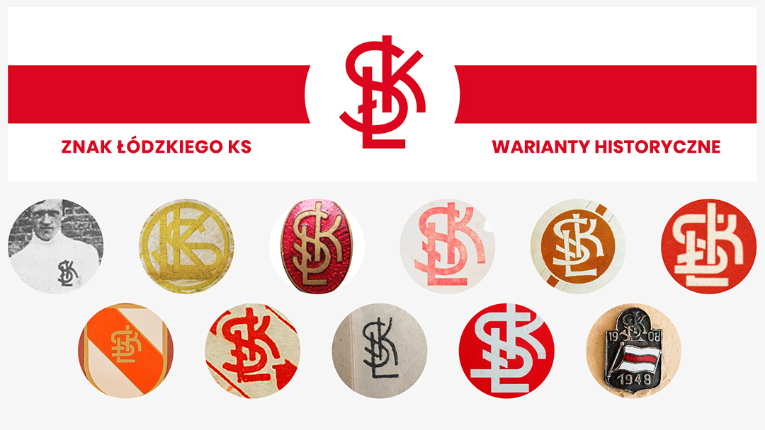
Refreshing the logo of the 111-year-old sports club was not a simple task. All the more so when dozens of (if not hundreds) of different variants of the emblem were created over the years, as in the pre-computer era ŁKS did not have a unified version of its club emblem.
The most characteristic symbol of the club was the monogram, the so-called „Przeplatanka” that has been with the team since its birth. Together with representatives of the club, which after 7 years absence returned to the Ekstraklasa, we decided to restore its original (or at least oldest known) version. We based our work on the drawing of the „Przeplatanka” visible in a picture of the 1911 team. My task was to draw a mark in a professional manner and to prepare its specifications.
The 1920s were an exceptional time in the history of Łódź. The multicultural city flourished economically and artistically, and its most famous sports club – ŁKS – represented the city in the Polish football top flight. The Łódź avant-garde of this era could thus give us a way of developing the ŁKS brand.
The first step was made – the club has a new logo, based on inter-war period drawings. I invite you to watch a short animation, showing how the new „Przeplatanka” of the club came into being.
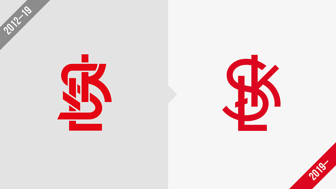
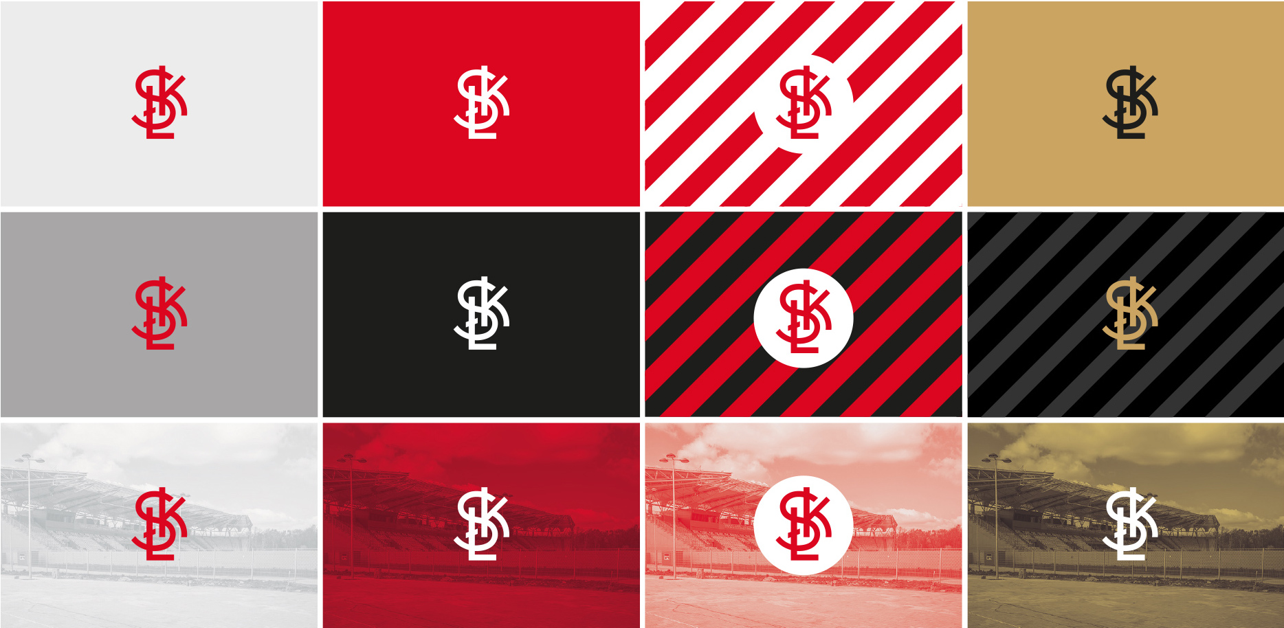
The former logo of the club had a more complicated form – and the spaces in between the letters caused problems when smaller sizes of the image were used on the internet.