
IMED24
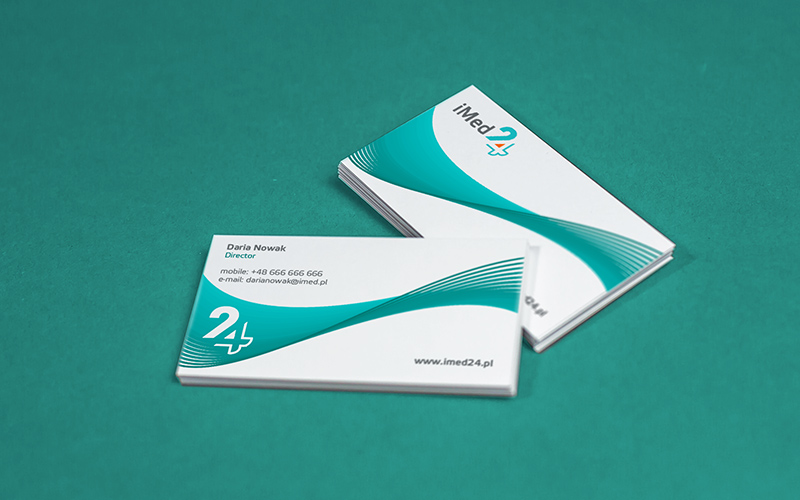
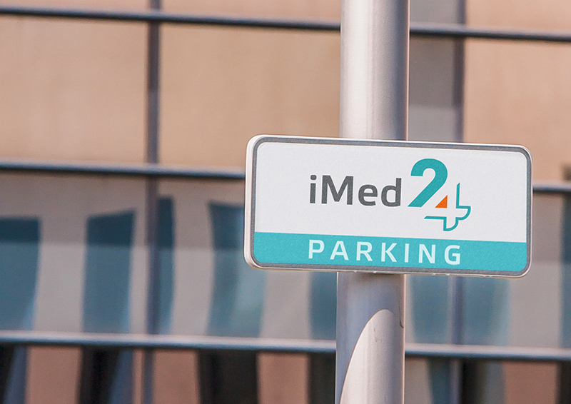
This was one of the first tasks I was entrusted with after being employed at the Polish software company Comarch. I was to develop a family of characters for the new platforms of the company: iBard24 (data backup), iMed24 (medical clinics) and iReward24 (loyalty programs).
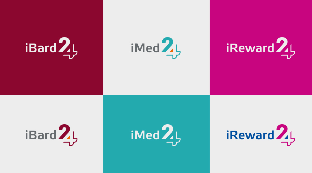
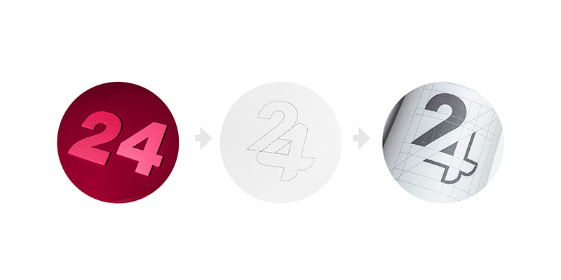
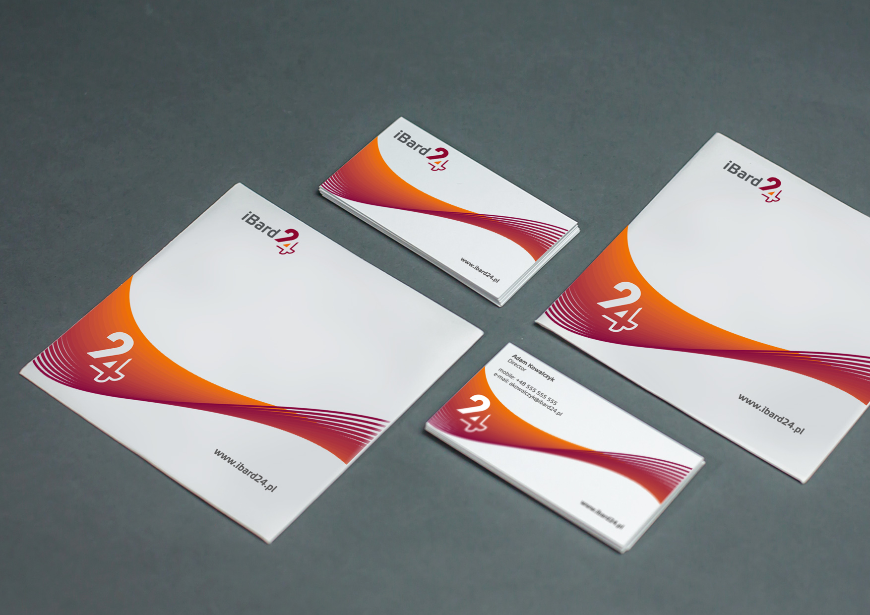
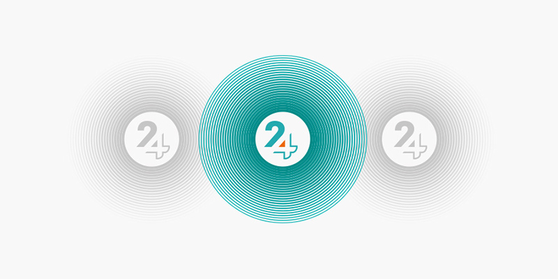
After a few attempts, I decided to go for a typographical figure which stood out – I made the monogram „24” in a characteristic style, in which the bottom line of the number „2” was also the negative space of the number „4”. The products were also distinguished by a colour code.
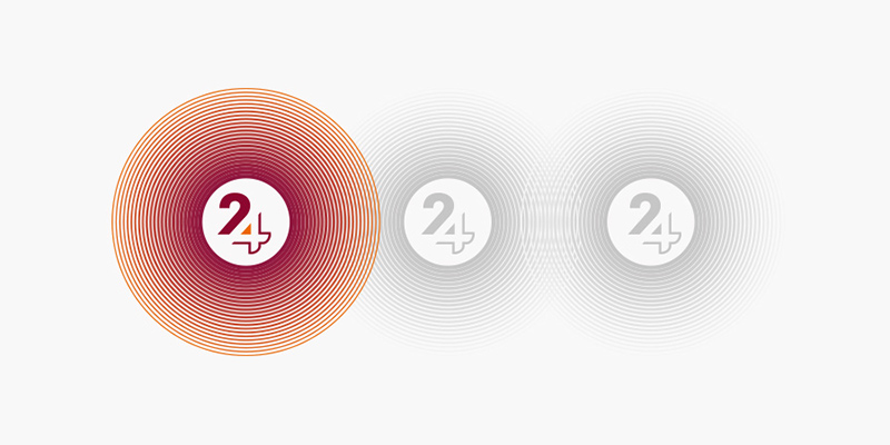
In graphics, I used a wave motif to represent a stream of data flowing between the website users.
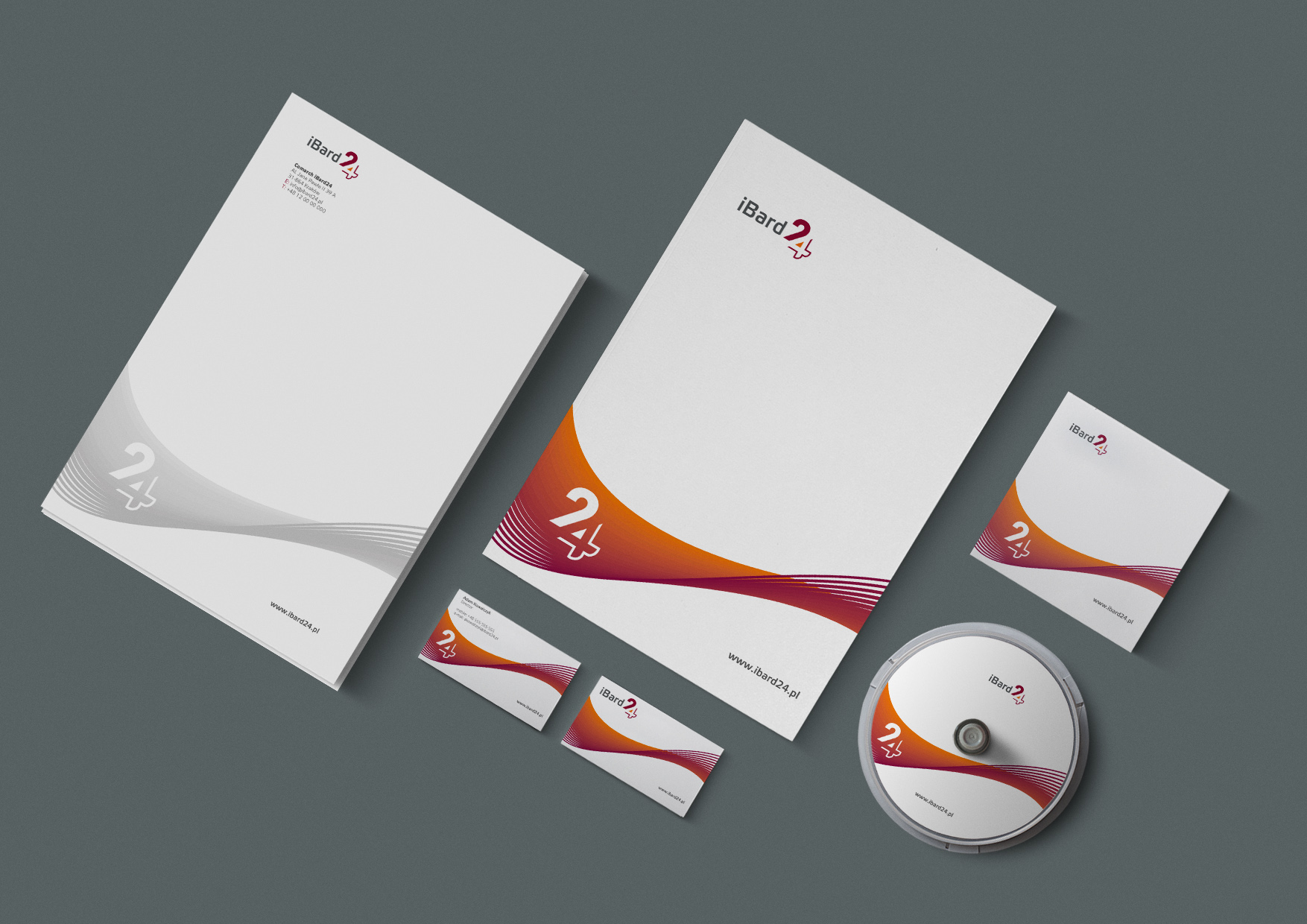
In the end, the project was not implemented, as each platform got its own pictogram. The platform’s logos in later years were changed a number of times. I have a fondness for my project – not only because I got a bonus for it 😊 but also because it was one of the first monograms I designed. Today I still really like these characters, I think they are timeless.
YEAR
2008
CLIENT
Comarch