KS RADLNA
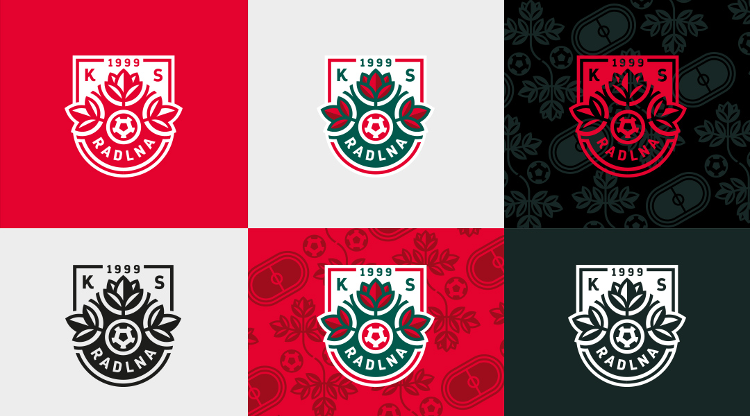
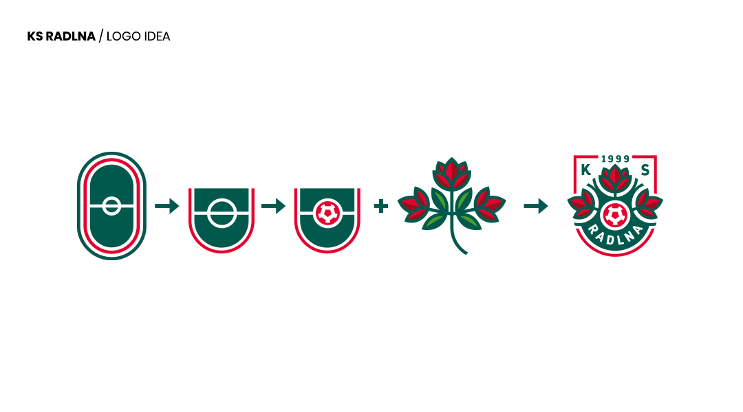
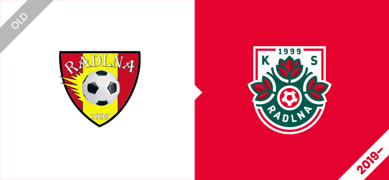
„An original twig with three stalks with leaves, middle flower larger and developed, two lateral smaller” – was a description of the graphical sign of the Radlna commune from 1909, located in the vicinity of Tarnów. Based on these memories, I created a new crest for the local football club KS Radlna.

The new project contains also a traditional ball in club’s colors – white and red. The shape of the shield could be explained as the fragment of the pitch.
