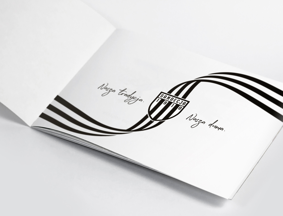
SANDECJA NOWY SĄCZ
For the football club Sandecja Nowy Sącz, founded in 1910, I developed a visual brand entitled „Duma Krainy Lachów” (The Pride of the Land of the Lachs), refreshed the logo (coat of arms) and prepared templates for visual identification materials.
GENESIS OF THE PROJECT
During the period of post-Communist transformation Sandecja Nowy Sącz lost the patronage of the state railways (ZNTK) and became a city club. The changes not only affected the club’s name (which changed from KKS Sandecja to MKS Sandecja Nowy Sącz), but also the club’s coat of arms. At the turn of the century, an odd logo was created on the basis of the Corelart Clipboard shield with the addition of a black crown.
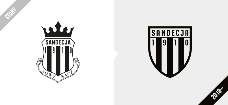
This emblem survived for a surprisingly long time, even up until the club was first promoted to the Ekstraklasa in 2017. After their relegation from the Polish top flight in 2018, club officials decided to make a change. I was entrusted to refresh the club’s historical emblem and to develop a brand-manual and a graphic motif for Corporate Identity materials.
THE PRIDE OF THE LAND OF THE LACHS
As a part of the project, I prepared an outline for the visual strategy for the club and the slogan „Duma Krainy Lachów” that refers to the local traditions of the club’s region.
HISTORY OF THE CLUB EMBLEM
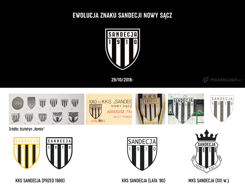
On the occasion of rebranding, I analysed dozens of versions of the coat of arms, used by the club before 1989.
CORPORATE IDENTIY GRAPHICS
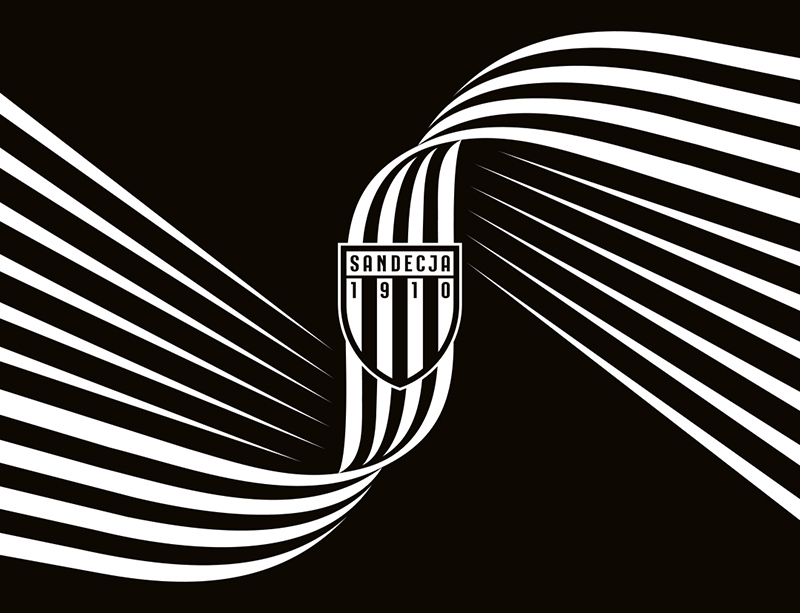
This identification accentuates the local character of the club, which is strongly related to the region. The classic form illustrates the attachment of the residents of the Nowy Sącz region and the club supporters to tradition, and the ascetic tone expresses their courage and resoluteness.
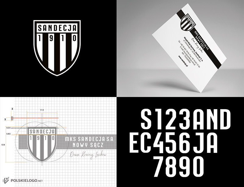
The presentation of the new emblem took place in October 2018. The club authorities introduced the new brand over the course of the next year.